Here, are 3 of the website layouts I'm considering using for my final website layout.
1.
2.
3.
I've considered many different possible layouts through research of different websites of the same genre, and have narrowed it down to these 3, as I believe these 3 would work the most of the type of website I am creating.
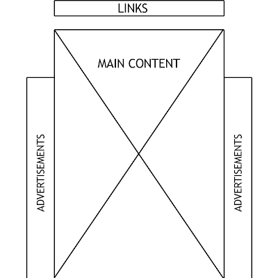
Design 1 is now becoming more popular across the web as an easy way to combine a background of the website with a flash advertisement as well. the advert would be embedded on top of the background image, and usually aligns with it to create a seem less design, but not always does the design have to be flash as you can see here. The main content of the website would be contained inside of one main table, consisting of smaller tables of content. Another small table would be located above the main table to contain all the links such as "Login" and "Register".
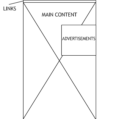
Design 2 consists of a main table filling up the full web page from top to bottom, again being broken to contain smaller tables, of which will each contain their own section of content. As well as content tables, there is again a smaller, thin table about the main content to contain the main links of the web page. The advertisements this time, would be embedded within the main table along side the other tables of content.
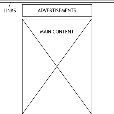
Design 3 is my favorite design, it is in my opinion, the cleanest and easiest to use. All of the content is again located in one main table and isn't broken up by advertisements. The links are located in a small thin table at the top of the web page, separated from advertisements and content and easy to access. Below is the advertisement, separated from main content and links, easy to distinguish and something that isn't associated with the website in any way. Continuing down the web page from the advertisement is the main content. This design is clean and simple to use, but I will be asking the public in a voting scheme which design they think would work best as it is up to them to decide, as they use the website.
1.

2.

3.

I've considered many different possible layouts through research of different websites of the same genre, and have narrowed it down to these 3, as I believe these 3 would work the most of the type of website I am creating.
Design 1 is now becoming more popular across the web as an easy way to combine a background of the website with a flash advertisement as well. the advert would be embedded on top of the background image, and usually aligns with it to create a seem less design, but not always does the design have to be flash as you can see here. The main content of the website would be contained inside of one main table, consisting of smaller tables of content. Another small table would be located above the main table to contain all the links such as "Login" and "Register".
Design 2 consists of a main table filling up the full web page from top to bottom, again being broken to contain smaller tables, of which will each contain their own section of content. As well as content tables, there is again a smaller, thin table about the main content to contain the main links of the web page. The advertisements this time, would be embedded within the main table along side the other tables of content.
Design 3 is my favorite design, it is in my opinion, the cleanest and easiest to use. All of the content is again located in one main table and isn't broken up by advertisements. The links are located in a small thin table at the top of the web page, separated from advertisements and content and easy to access. Below is the advertisement, separated from main content and links, easy to distinguish and something that isn't associated with the website in any way. Continuing down the web page from the advertisement is the main content. This design is clean and simple to use, but I will be asking the public in a voting scheme which design they think would work best as it is up to them to decide, as they use the website.


Comments
0 Response to 'Website Layout Plans'
Post a Comment