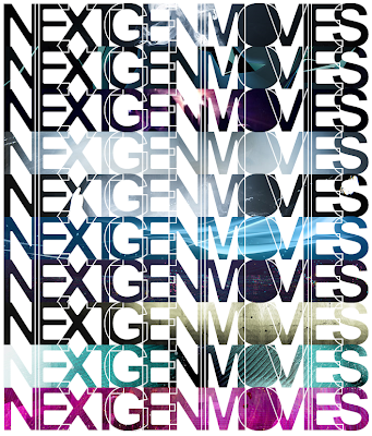
For my ident and website, I wanted something simple yet detailed, to fit in with the theme of my website/tv channel.

This is the simple logo That I have created using Photoshop, It basically consists of the font Arial (bold) with a white fill and a black stroke around the text. I then flattened the text layer so I could work into it. I started removing the white so what was left was just the black stroke, I then began to move the letters individually to overlap them each slightly.
After creating this I started to experiment with different ways of implementing it.
Here are a few of my first experimentations:

All I have done here, is cut a solid shape of the text out from various different designs, and then added the the stroke from the previous design over the top, which was then inverted to give the stroke and the effect that the letters outlines have been cut out from a single shape.
This will be my logo for use throughout my designs and will be used throughout my project, on the website, in the Ident and throughout advertising.


Comments
0 Response to 'Logo Design'
Post a Comment