1.
2.
3.
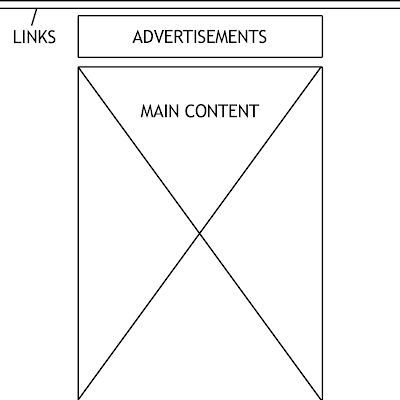
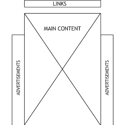
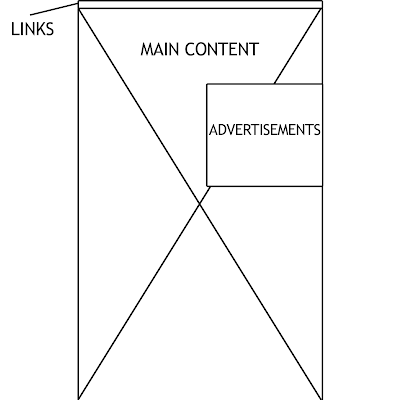
I've considered many different possible layouts through research of different websites of the same genre, and have narrowed it down to these 3, as I believe these 3 would work the most of the type of website I am creating.
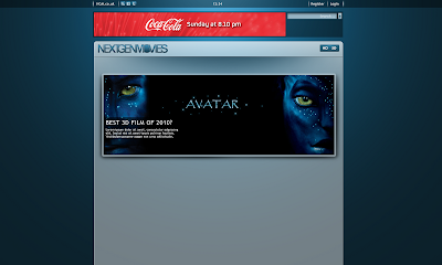
Design 1 is now becoming more popular across the web as an easy way to combine a background of the website with a flash advertisement as well. the advert would be embedded on top of the background image, and usually aligns with it to create a seem less design, but not always does the design have to be flash as you can see here. The main content of the website would be contained inside of one main table, consisting of smaller tables of content. Another small table would be located above the main table to contain all the links such as "Login" and "Register".
Design 2 consists of a main table filling up the full web page from top to bottom, again being broken to contain smaller tables, of which will each contain their own section of content. As well as content tables, there is again a smaller, thin table about the main content to contain the main links of the web page. The advertisements this time, would be embedded within the main table along side the other tables of content.
Design 3 is my favorite design, it is in my opinion, the cleanest and easiest to use. All of the content is again located in one main table and isn't broken up by advertisements. The links are located in a small thin table at the top of the web page, separated from advertisements and content and easy to access. Below is the advertisement, separated from main content and links, easy to distinguish and something that isn't associated with the website in any way. Continuing down the web page from the advertisement is the main content. This design is clean and simple to use, but I will be asking the public in a voting scheme which design they think would work best as it is up to them to decide, as they use the website.
Here is my nextgenmovies ident after the first edit, and adding of the audio.
For this chip, I tried to find mechanical, machine noises, as well as something flying towards and past you, to give the effect as the text explodes and flies past the camera.
I will still be working on this video to add some more finishing touches, such as fading in from black, and experimenting with effects and ambient noises.
This is the first render of my ident for my tv channel, for this I have used cinema 4D to create the desired effect.
Here is the first ever animation clip that I made using cinema 4D and rendered for youtube, it the titles of a game which were the first things that came into my head at the time, but I will be looking at using a more sophisticated approach to this program for my ident.
Here is a test real published by Maxon showing some of the commercial use of the program, and some of the high quality rendered video content that is produced.
From looking at this, I think this program would be prefect for creating an Ident for my TV Channel.
I will continue to look for other videos and some small tutorials, as well as workin with the program to get to grips with it.


Again, the analysis of this website is very relevant to m while constructing my own TV website, The genre of content is not completely the same, but the website concept, usability and design is relevant.
The website first of all is very easy to use, everything is plain black and white without and hassle, the only images on the page are representing the shows in question, and even then its only 1 image at a time, with basic text overlaid in a stylish yet simple fashion. This, itself makes the website easy to access and the usability extremely easy.
The style is extremely clean and minimalistic, Its not hard to use in the slightest, the style makes it easier to use. The ease of use makes it easier for the audience to find content on the website and easy to view. This website has a consistent house style throughout all the website, but does not link well into its other channels such as E4 It also links well with the TV Channel and Logo. The style of the website, colours and theme are carried out across both mediums of TV and Website.
LIIAR:
L- Language
The website content can be quite witty and humorous at times, with works well with the transition across the board from TV to website. The website is still very easy to use and understand. I definitely think that this website appeals to an older audience with the language that is used. Its all still easy to understand, and again on some levels managed to be sophisticated.
I-Institution
The institution behind this website would be Channel 4 the television provider. This can be seen throughout the website with the very reckognisable franchise logo, which embeds itself within images etc on the website to show the link and in the people behind the website. The website ties in well with the TV Channel, but singles itself out from the other channels such as E4.
I-Ideology
The ideas behind this website is for Channel 4 to provide a service online that is similar to the tv service. The show TV listings, trailers and information on up and coming TV series. On the other hand, they also provide a different service from other channels, and provide an outstanding catchup service. This means that if you miss a tv show, or want to re watch it, its simple, just log in and watch. The service originally started with a downloadable program where you could download the missed programs for a set period of time, as time went on the program became outdated, and everything became online streaming.
A-Audience
I believe that the audience for this particular website isn’t particularly widely open, the genre and type of content and humour to me indicate an old target audience. Still the website does need to be appealing to a large audience, I just feel that this website in particular is a little but more organised and not as open to a larger audience, that they want to attract the right people, not masses of people that don’t require of use the website and its services.
R-Representation
This website represents all that is channel 4, as a channel, company and business. It really does reflect the TV channel and the mentality of the broadcasters etc. The website is well put together and profession, which is a clear representation as them as a company.
Sky Movies
Analysis of this website is extremely relevant to the creation of my own TV website, since its based around the same genre of as my website, a TV Channel centred around Movies.
First of all, this website has a consistent house style throughout all the web pages, as well as the TV Channel itself, the Logo style and website colours and theme are carried out across both mediums. The style itself is pretty clean cut, its not overly complicated and is easy to use for the audience, the content needs to be easy to find for the user and well placed and embedded into the site. All of this is successfully achieved on this web page.
Theres a big use of shortcuts around the website, again this is making the websites content more easily available for the user.
The whole look of the website Is very new, stylish and clean cut. The design and colour scheme of the website also matches well with the channels Ident, creating a seamless continuous house style throughout.
LIIAR:
L- Language
The website itself uses terms and phrases that all audience can understand, because this website has to appeal to a wide range of people and a large audience of different gender and age. The website is well written, and easy to understand. No lingo that first time users or new comers will not understand. Although this is true, the website also still manages to be sophisticated.
I-Institution
The institution behind this website would be the satellite television provider, Sky. This can be seen as we know from the name, that this is a sky channel, and it also shares the same logo as the sky franchise. As well as this, the sky movies logo, the website is also very well integrated with the other aspects of the Sky company.
I-Ideology
The ideas behind this website is for it to accompany the television channel. The website needs to provide a hand in hand service with the channel, to provide information for the channel such as program timing. Also, the website has to pull in the audience, and this audience needs to be people that aren’t already sky customers, this website needs to sell its service to the general public, to people who don’t have sky, or this particular sky package. The latest in movies is also shown on the website, the channels own exclusive showings are about most, but there is also new film trailers and reviews for films that aren’t showing on the channel.
A-Audience
As previously mention, there is a mass audience for this website. Not only will people who have sky and sky movies use this website, but it needs to appeal to potential future customers not just the current customers, I feel it needs to reach the audience by giving the user an easy to use experience which will make them want to come back to continue use with the service.
R-Representation
This website represents all that is Sky, as a company and as a channel. The website shows the ease of use of there system, there quality of the system they provide and to try and show there flawless service.
When the polls show a strong enough correlation of results towards one title, I'll look into buying a domain to host the website under.
Here, are 5 Things a successful web page should have:
Clear navigation
The navigation on your website tells user how to find the information they need. You should make sure your navigation is easy to find and very clear. Try writing it in the terms that link back to why someone is visiting your site.
Visually appealing and simple home page
When designing your homepage, don't try to say everything about your business on your home page and clutter it, Keep it simple and easy to read so the visitor comes away with a good basic understanding of your business and what they can find on your site, but keep it brief , you can go into much more detail in your subsequent web pages.
Prominent Contact Information
Even in this online world, sometimes customers will want to reach out to a real person so make your contact information easy to find – and if possible – include a phone number as well as an email address.
FAQ’s
Especially since my website relates to my "product" or the TV Channel and programs, it is smart to include an FAQ (Frequently Asked Questions) section to help customers easily find answer to questions about your services. For smaller businesses this may also help cut down on phone calls or tech support emails, saving time and money for the business owner.
Instructive
Make sure it is clear to visitors what you want them to do when they get to your site. If your intention is to drive sales with your site, be sure you include special pricing, promotions or offers and make it easy for customers to buy. If your intention is to educate visitors about your business, make sure information about your company is prominently displayed and easy to find and easy to navigate around.
Again, I will be taking all of these into consideration while designing my website. I think that my website MUST have a simple navigation, as a TV Channel is viewed by millions of viewers, some older, some young, some who find it hard to use the Internet, and some who are fluent. My web page needs to be easily accessible for any customer to view, to create a wide audience.
Shneiderman's: Eight Golden Rules of Interface Design
1 Strive for consistency. Consistent sequences of actions should be required in similar situations; identical terminology should be used in prompts, menus, and help screens; and consistent commands should be employed throughout.
2 Enable frequent users to use shortcuts. As the frequency of use increases, so do the user's desires to reduce the number of interactions and to increase the pace of interaction. Abbreviations, function keys, hidden commands, and macro facilities are very helpful to an expert user.
3 Offer informative feedback. For every operator action, there should be some system feedback. For frequent and minor actions, the response can be modest, while for infrequent and major actions, the response should be more substantial.
4 Design dialog to yield closure. Sequences of actions should be organized into groups with a beginning, middle, and end. The informative feedback at the completion of a group of actions gives the operators the satisfaction of accomplishment, a sense of relief, the signal to drop contingency plans and options from their minds, and an indication that the way is clear to prepare for the next group of actions.
5 Offer simple error handling. As much as possible, design the system so the user cannot make a serious error. If an error is made, the system should be able to detect the error and offer simple, comprehensible mechanisms for handling the error.
6 Permit easy reversal of actions. This feature relieves anxiety, since the user knows that errors can be undone; it thus encourages exploration of unfamiliar options. The units of reversibility may be a single action, a data entry, or a complete group of actions.
7 Support internal locus of control. Experienced operators strongly desire the sense that they are in charge of the system and that the system responds to their actions. Design the system to make users the initiators of actions rather than the responders.
8 Reduce short-term memory load. The limitation of human information processing in short-term memory requires that displays be kept simple, multiple page displays be consolidated, window-motion frequency be reduced, and sufficient training time be allotted for codes, mnemonics, and sequences of actions.
These "Rules" where written by Ben Shneiderman, He proposed this collection of principles that are derived heuristically from experience and applicable in most interactive systems after being properly refined, extended, and interpreted.
[Shneiderman's Goldern Rule's taken from - "Designing the User Interface"]
While designing my webpages for my new TV Channel, I will be using these rules to create a well made and productive website thats flows and does not create confusion for the user.
I have chosen to create a website for a New TV Channel, this is my medium, and to help me create a successful website I have researched the history of my chosen medium, Websites.
The World Wide Web was created in 1989 by CERN physicist Tim Berners-Lee. It was announced, on 30th April 1993 by CERN that the World Wide Web would be free for everyone to use. Websites themselves haven't always been the same as way we interpret them today, before the introduction of web languages such as HTML and HTTP which are really the building blocks upon which we build websites, other protocols such as File Transfer Protocol and the Gopher Protocol were used to retrieve individual files from the websites server. These protocols where in place to create a simple directory of files etc which the user could navigate around to choose files to download. Documents on the web were usually presented as plain text files without any formatting or where encoded in word processor formats.
What was the first website?
This itself is a tough question, the first ever "website" wasn't really a website at all, but a page which linked between the pentagon and several nearby Universities. This was in the early 70's and the computers used in the network weighed over 5 tonnes each, and all the computers linked to the networks together weighed over 100 Tonnes. This whole network was originally done as an experiment to see if mass information migration would be stable using wires, this was useful to the pentagon as they could share all their information with their bases around the USA and if it wasn't for the success of this pentagon networking, we wouldn't have the internet today.
Aside from this networking, the first "Website" of the likes we know was "http://nxoc01.cern.ch" launched 10/07/04 and the first "Webpage" was "http://nxoc01.cern.ch/hypertext/WWW/TheProject.html" This website shut down quite some time ago.
Their are hundreds of different types, or sub genres of websites but I will be focusing on creating a hybrid-website based around Corporate/Content website.
To assess my ability to UNDERTAKE, APPLY and PRESENT appropriate research.
I must produce a media portfolio comprising a main and two ancillary texts.
A presentation of my research, planning and evaluation.
My media portfolio will be produced through a combination of two or more of the following media:
Video
Web based
Audio
Games software


